Fundamentals of Art — Reinterpreting Historical Aesthetics in Packaging Design
This project, developed for the Fundamentals of Art course, explores how historical visual styles can be reinterpreted through a contemporary lens to elevate a product's perceived quality and commercial value. Rather than simply replicating period aesthetics, the goal was to understand their core visual codes — typography, ornamentation, color, and composition — and translate them into packaging design that feels both authentic and market-ready today.
Four distinct movements were explored — Victorian, Baroque, and Art Nouveau — each applied to a different product category, resulting in four packaging labels that speak to different sensory and commercial narratives.
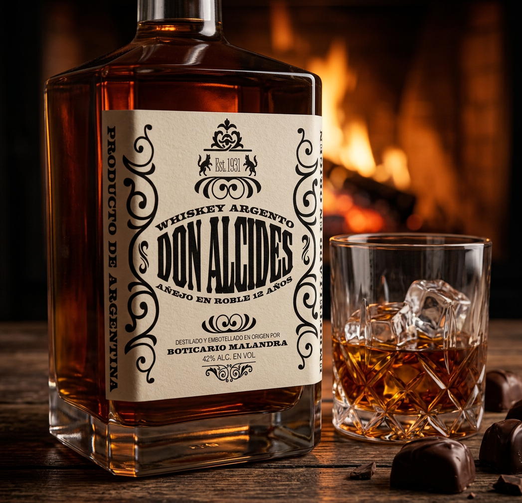
Don Alcides (whiskey) blends Victorian and Western influences with subtle Baroque touches. The label leans on decorative typefaces, slab serifs, and layered scrollwork ornamentation — visual codes closely tied to late 19th and early 20th-century consumer goods — while keeping the composition legible and easy to read at a glance.
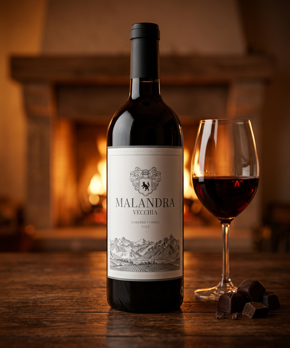
Malandra Vecchia (wine) draws from Baroque design principles and toile de jouy illustration, a technique rooted in 18th and 19th-century decorative art. An AI-generated Andean vineyard landscape was combined with Bodoni Moda typography and a heraldic crest, resulting in a composition that feels clean and refined while still projecting heritage, tradition, and legacy — qualities closely associated with the world of wine.
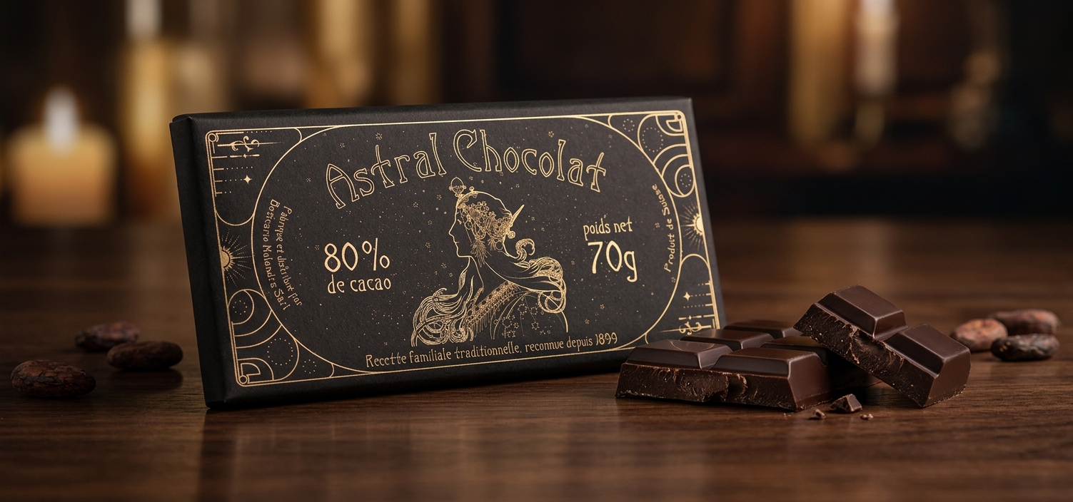
Astral Chocolat (chocolate) reimagines the fluid, organic lines of Art Nouveau through gold linework set against a black background. A muse figure surrounded by a starry motif sits at the center of the design, chosen to evoke femininity and a sense of nurturing warmth, while the overall palette communicates lightness, refinement, and sensory indulgence beyond pure commercial value.
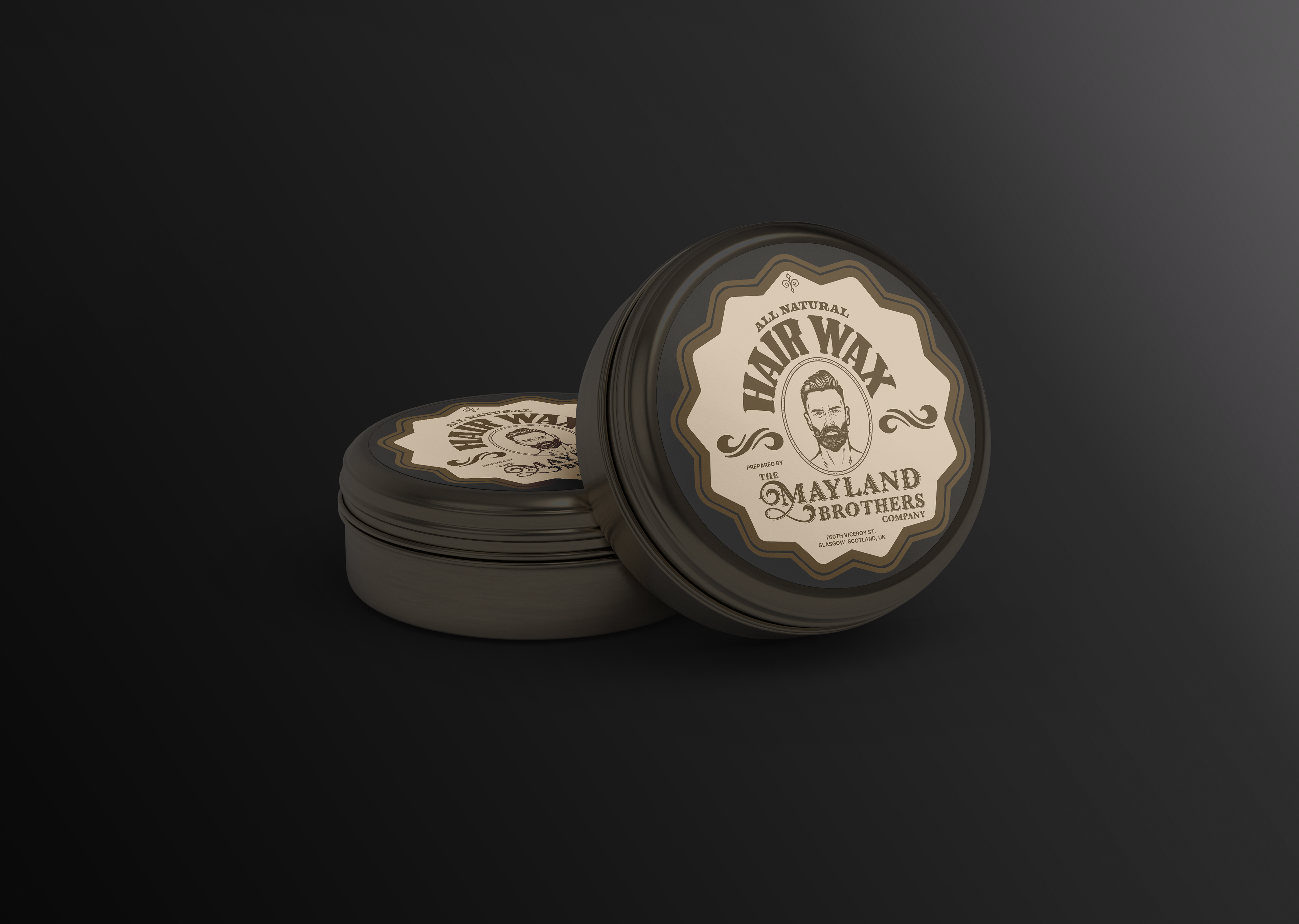
Mayland Brothers (hair wax) returns to Victorian visual language, this time applied to a men's grooming product in the style of late 19th-century barbershop branding. The label prioritizes fast, clear readability without sacrificing visual richness, deliberately avoiding the red-and-blue color conventions so common in today's grooming industry.
Across all four pieces, the process combined research into period-accurate design references, careful typographic selection matched to each era, and AI-assisted image generation used as a creative tool to produce custom illustrations and visual assets.